

Figure 1: Extratropical cyclones (low-pressure systems) can bring hazardous weather such as high winds and heavy rain. Photo: nevarpp/iStock/Getty Images Plus
May 2021 saw an update of ECMWF’s suite of synoptic-style forecasting charts, known as the extratropical cyclone database (CDB).
Europe sits within the extratropics and day-to-day weather tends to be strongly influenced by low-pressure systems (extratropical cyclones), and their associated warm and cold fronts. The extratropical cyclone database products include synoptic-style charts to help forecast these systems, and the hazardous weather they can bring, such as heavy rainfall, strong winds, snow and thunderstorms.
The term synoptic simply means a general summary (or synopsis). In weather forecasting, surface synoptic charts can provide an overview of atmospheric conditions and they are a familiar and fundamental tool for forecasters. Synoptic charts only tell part of the story, however, and they are designed to be used alongside the large array of other forecast products from ECMWF.
The ECMWF extratropical cyclone products are based on post-processing of the medium-range ensemble forecast (ENS), and extend out to 15 days ahead. Results from the high-resolution (HRES) forecast are also included. The charts cover Europe, the North Atlantic and surrounding areas of the northern extratropics and they are publicly available in real time as part of the ECMWF suite of open charts.
Developed in collaboration with the UK Met Office, the extratropical cyclone database products have been available from ECMWF for more than a decade. The May 2021 updates focused on improvements to the visualisations and important behind-the-scenes changes to the software.
Following conversion of the post-processing algorithms to Python-based code at the UK Met Office, the new code was implemented and further developed at ECMWF. It will facilitate easier software adaptation in future and provide greater portability of the products to other platforms (such as ecCharts, an ECMWF software package used by forecasters to manipulate and visualise ECMWF products).
An overview of the extratropical cyclone database
These web-based products aim to represent the location and behaviour of near-surface synoptic-scale features in a variety of ways (Figure 2). The features represented are those which can bring adverse weather:
- Warm and cold fronts, which are shown as lines, mark the boundaries between and the movement of different air masses.
- Cyclonic (low-pressure) features are shown as spots. The identification of these features is loosely based on a conceptual model of extratropical cyclone development: cyclones often (but not always) go through these stages:
- diminutive wave – a minor wave-like disturbance which forms on a warm/cold front
- frontal wave – a more developed feature that includes both warm and cold fronts, and that may have a low-pressure centre associated
- barotropic low – a mature or decaying low-pressure centre
For forecasters, knowing the location and likely track of lows and their associated fronts is an important indicator of possible temperature changes and other weather conditions. These systems can bring destructive winds, heavy rainfall and snowfall, sudden changes in weather, heavy showers, lightning, and hail. Such hazardous conditions can have serious impacts on a range of activities: transport, agriculture and the energy sector to name just a few.
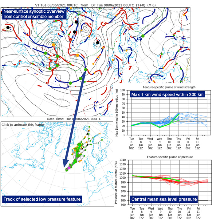
Figure 2: The products from ECMWF’s extratropical cyclone database provide forecasters with familiar near-surface synoptic-style charts based on 51 ensemble members and the high-resolution HRES forecast (HRES). The products focus on fronts and cyclonic weather systems that can be associated with hazardous conditions such as strong winds, snow and rain. Some examples are shown in the figure and described in the text.
A synoptic-style chart from the ECMWF control run (Figure 2, top left) provides an overview of the general weather situation. It shows mean sea level pressure, 1,000 to 500 hPa thickness (an indicator of air mass temperature), surface warm and cold fronts (red and blue lines respectively) and various cyclonic features (orange, green, black dots).
Forecasters can then click on individual features to view the predicted track and development of the low and look at possible adverse weather associated with it (Figure 2, lower left and right). The series of graphs shows, for example, a near-surface wind speed maximum associated with a particular low, with results shown from all the forecast realisations making it easy to see the agreement/divergence. Control and HRES are shown in bright green thin/thick (respectively) (with the track in the first 12-hour period highlighted in magenta).
Benefits for the forecaster
- The products use the ‘synoptic language’ of forecasters.
- They show near-surface fronts and weather systems which can be associated with adverse weather – high winds, rain, snow, and thunderstorms, for example.
- They provide a compact view of vast amounts of information (from 51 ensemble members, plus the HRES forecast).
- They show the range of possible outcomes – indicating forecast uncertainty.
- Instantly the forecaster can uncover the full range of possible outcomes, and then delve deeper, if need be, to look at individual ensemble members.
- Seeing whether the HRES forecast is representative of ensemble behaviour in a given region – i.e. does its solution lie “mid-range”?
- The information can be looked at in combination with other products, such as the Extreme Forecast Index (EFI), which also give guidance on extreme weather.
The automatic identification of fronts and cyclonic features
Traditionally synoptic charts were produced subjectively by forecasters, with fronts being identified by eye based on their skill and experience, using plotted surface observations of temperature, wind, local weather and other parameters (and gradients inferred in these parameters).
Even with the advent of computerised numerical weather prediction and automated plotting of surface pressure, weather observations and other fields, automatic identification of fronts remained difficult and was still done subjectively.
A breakthrough in the late 1990s at the UK Met Office provided a reliable method for determining the location of surface fronts objectively and this laid the foundation for the development of the automated synoptic-style charts, and ultimately for ECMWF’s extratropical cyclone database.
To usefully represent the 52 separate forecasts that are produced twice daily by ECMWF, and that go out to 15 days ahead, one would need about 1,500 charts per day, and it would be impossible to analyse so many by hand in real time!
The progression of warm and cold fronts
The fronts animation product shows the position of warm fronts (red lines) and cold fronts (blue lines) stepping forwards in time (Figure 3).
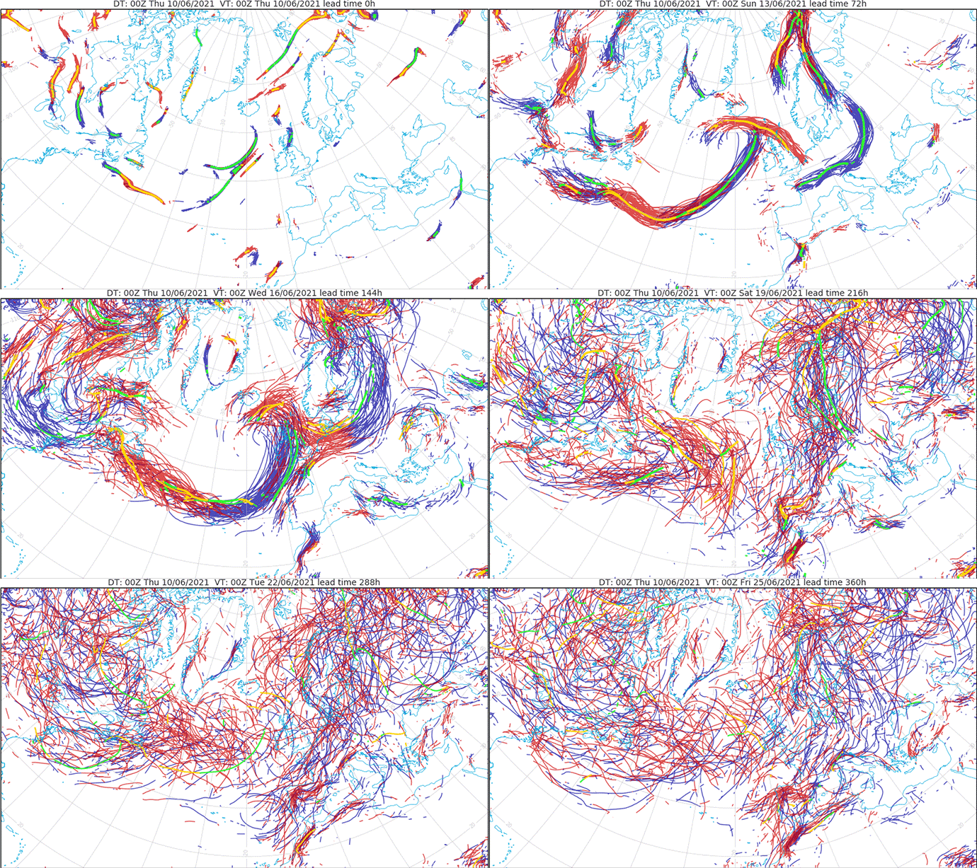
Figure 3: Animation of warm and cold fronts from a forecast starting at midnight on 10 June 2021. The animation shows the increasing ensemble spread as the forecast progresses.
Strike probability charts
Strike probability maps (Figure 4), broadly analogous to hurricane strike probability maps, indicate the likelihood of a cyclonic feature hitting a particular location. Forecasters can choose to highlight only lows associated with winds above certain thresholds, with the most extreme category denoting surface windstorms.
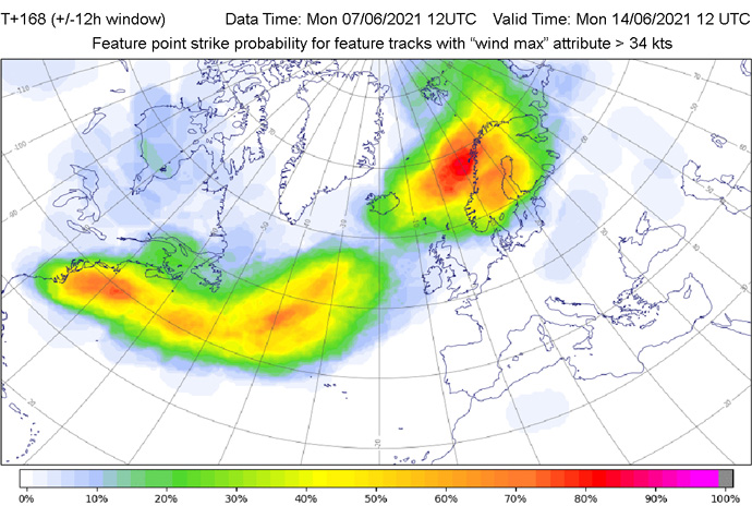
Figure 4: Storm strike probability maps show the percentage of ensemble members predicting the centre of a cyclonic feature passing within 300 km in a 24-hour period. This figure shows only those features with a maximum 1 km wind speed of more than 34 knots (gale force) within 300 km of the feature centre. Forecasters can also choose a threshold of 60 knots (extreme winds) or can look at all cyclonic features.
Cyclonic features and associated adverse weather – wind, rain and snow
Feature (or dalmatian) charts show the locations of all cyclonic features with dots (Figure 5). Forecasters can choose to look at these features in terms of a range of associated weather attributes: winds, rain, snow, mean sea level pressure, and 1,000–500 mb thickness, or alternatively show the feature type.
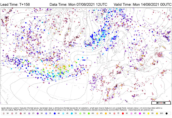
Figure 5: The feature (or dalmatian) charts show the location of cyclonic features. Mean sea level pressure contours are also shown (from the control (CNTL) run).
Forecasters can also choose to display these features in a way that highlights the adverse weather associated with them, such as maximum instantaneous mean winds in a radius of 300 or 600 km from the storm centre, or maximum or average rainfall or snowfall, in a 12-hour period, within a 300 km radius.
Here the dots denote maximum wind strength. A cluster of features which have associated with them 1 km maximum wind speeds of 60 knots or more can be seen in the western North Atlantic.
Looking at individual ensemble members
Forecasters can also look at ensemble members separately, using for example a range of postage stamp-style plots (see an example in Figure 6), or even drill down to have an even more detailed look at the synoptic evolution in a particular member.
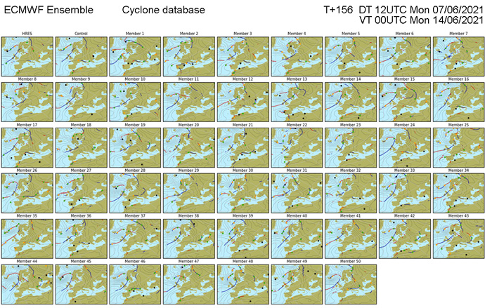
Figure 6: Various postage stamp-style charts give forecasters a view across all ensemble members, and an experienced forecaster’s eye can quickly pick out the related weather situations. The charts can be animated, and individual members can be investigated in more detail.
Future developments
As with other ECMWF forecast products, further developments to the extratropical cyclone database are continuously being investigated.
A new product developed by the UK Met Office indicates a “strike probability” for frontal positions. This could give forecasters an indication of the likelihood that a cold front will affect a particular region, for instance – with the potential, for example, for squally winds, heavy showers or hail.
Another area being looked at is identification of the most representative ensemble member in a certain situation.
All the charts in the extratropical cyclone database currently show a two-dimensional picture of the near surface weather patterns (focusing on 0-1 km above the ground). However, work has also been done to develop visualisations of fronts in three dimensions. In reality of course, fronts are three-dimensional structures and looking at their realisation in two dimensions provides only part of the picture.
